Photography Guidelines
Your brand’s feature image is the primary image used to showcase your brand throughout our platform. Our design team approves your feature image when you join Leez.
How is my feature image used?
This image is used in several places throughout Leez, including in the marketplace and in Leez marketing emails. It’s often a retailer’s first impression of your brand, so it’s important to have a compelling lifestyle image that gets retailers excited to browse your shop!
Feature image requirements
Your brand’s feature image must:
- Be high quality (minimum 1000 x 1200 pixels)
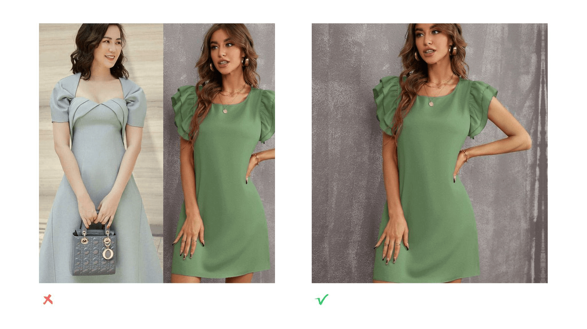
- Be a single image, not a collage of multiple images
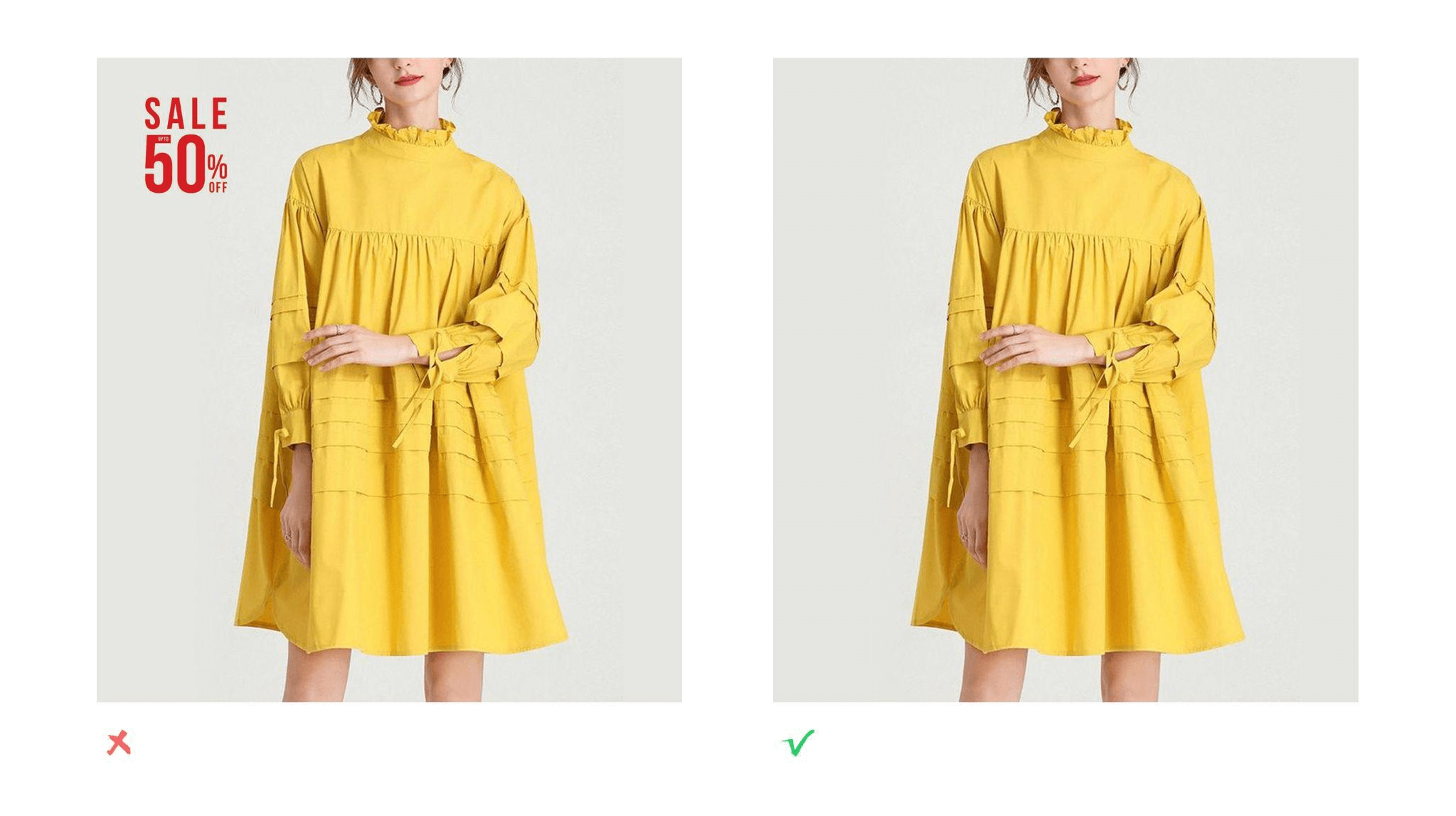
- Not include any words, watermarks, or logos
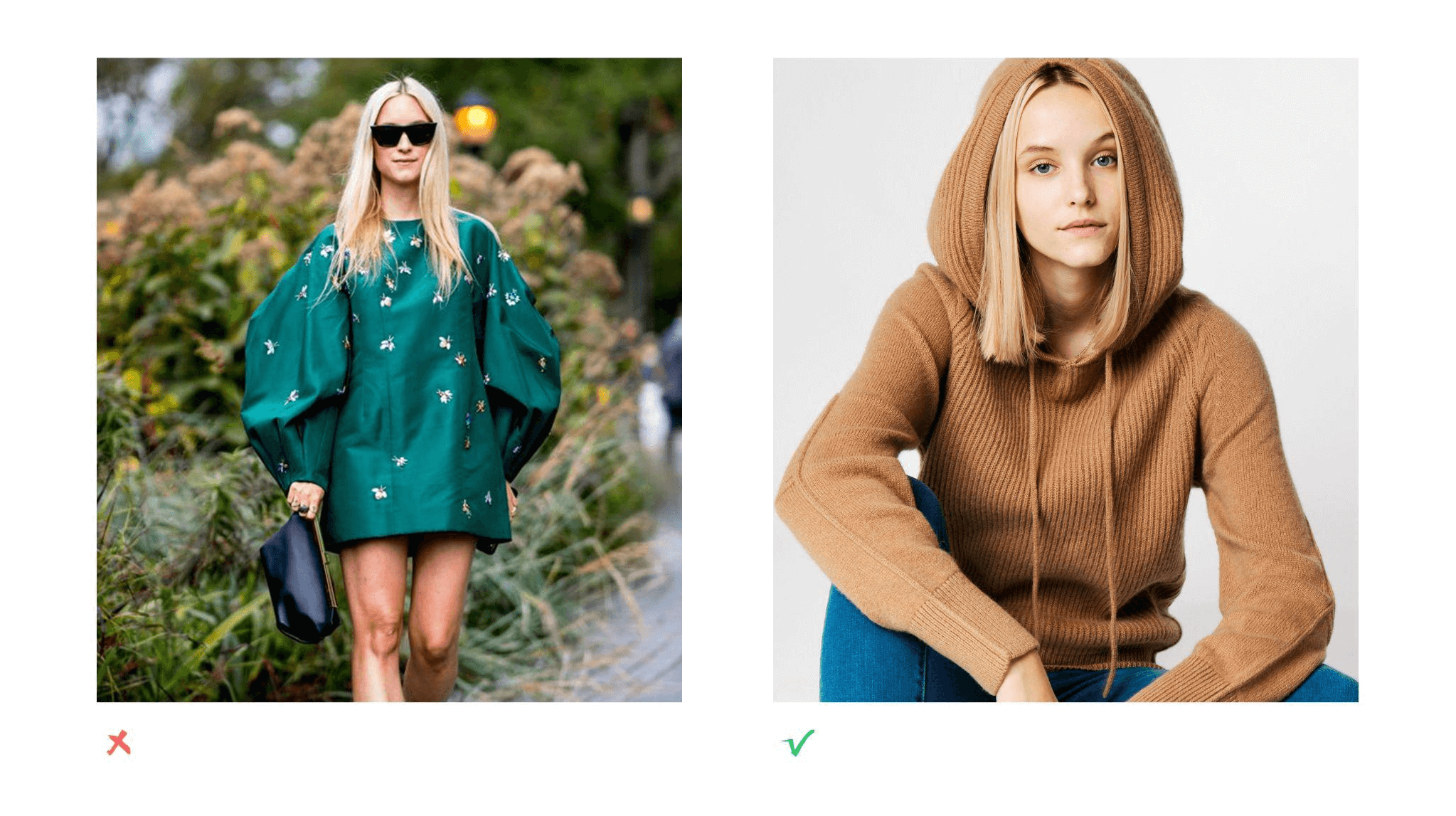
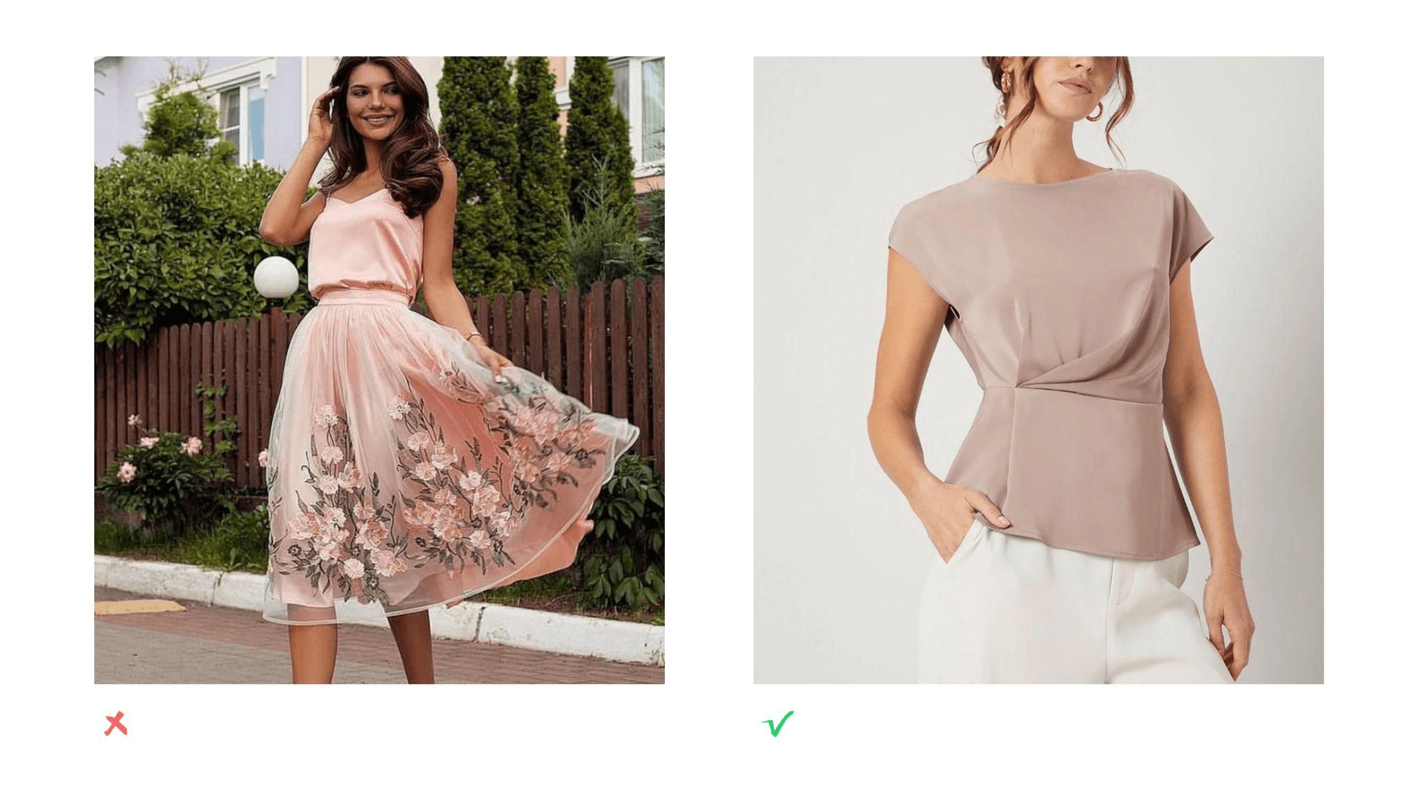
- The background is monochromatic, a low-saturated solid-color background
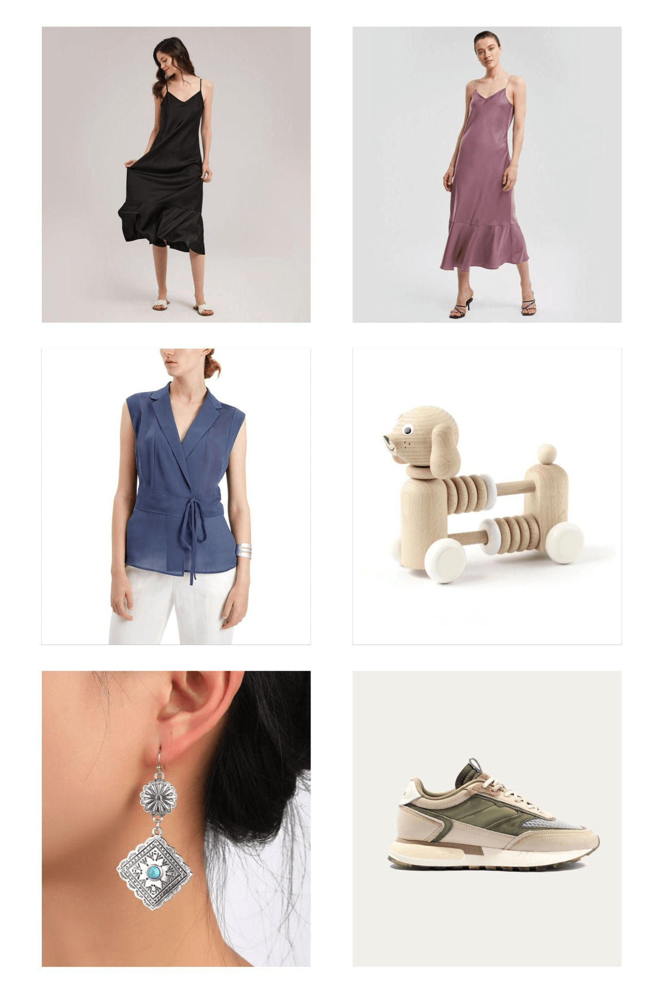
We recommend selecting a high-resolution lifestyle image that shows your best-selling product(s) in use (for example, a cheese knife with cheese and grapes on a cutting board). Less is more—avoid having too much pattern or noise in your feature image.
How to choose a great feature image
To best hook new retailers, here are some essential tips and guidelines for selecting a compelling feature image:
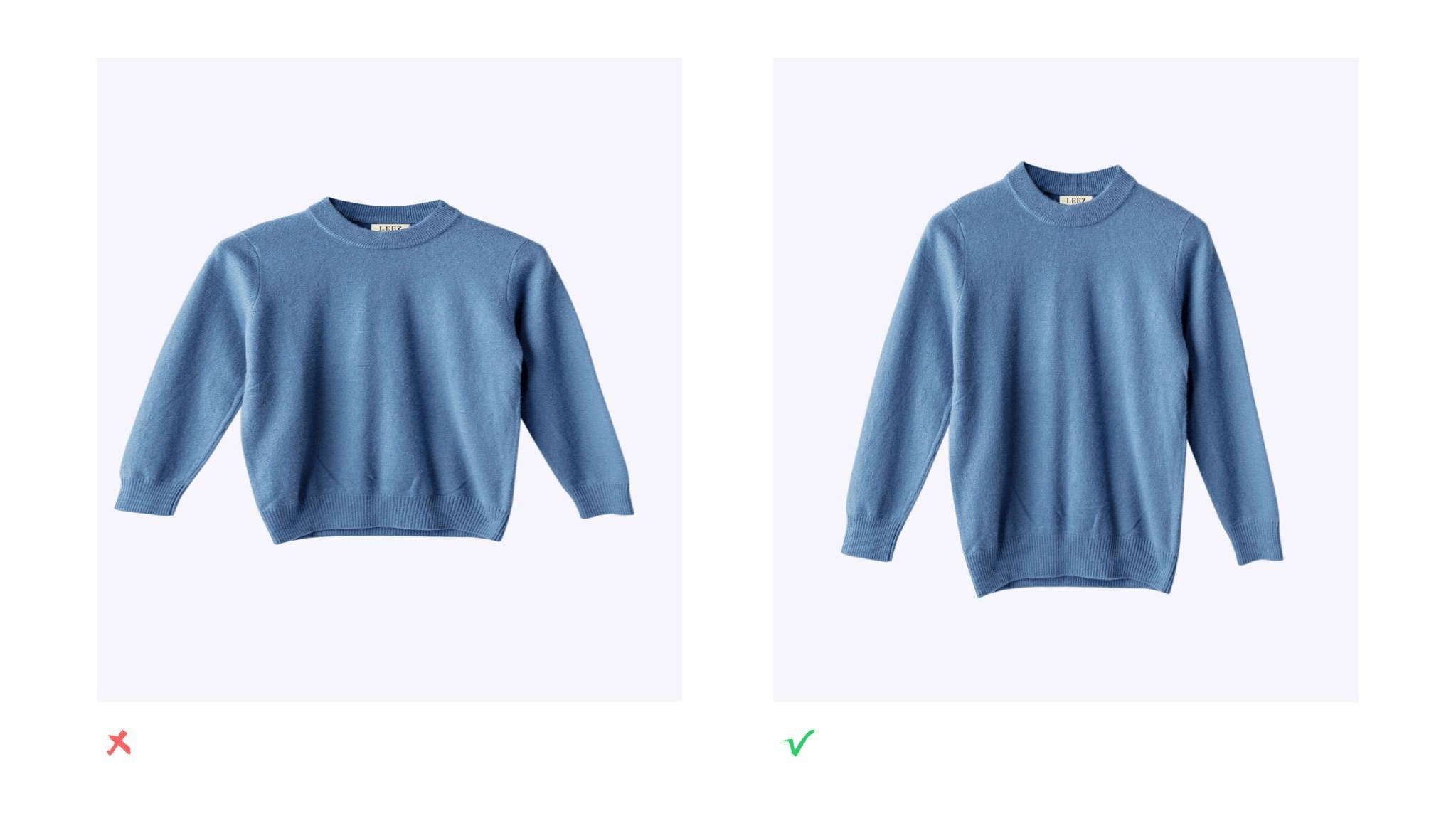
- Make sure your product is the main focus of your image.

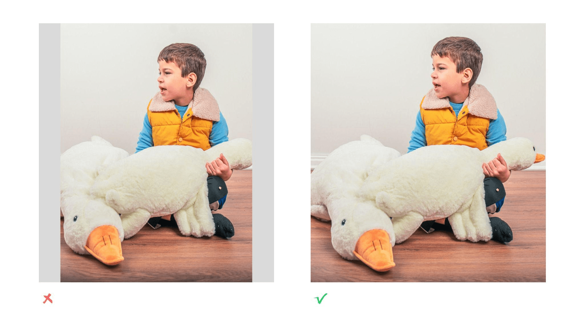
- Don’t stretch or distort your image to fit a square. Crop it instead.

- Crop your image to a square. It must fill a 5:6 ratio.

- Don’t include overlaid text or logos.

- Avoid collages and keep it simple.

Collages cause clutter in a space already crowded with many other brands. Choose a single image with a clear product focus. Simple, uncluttered often stand out more, as they provide rest to the shopper’s eye that may be weary from browsing many pages of content. - Provide visual context (avoid cluttered background).

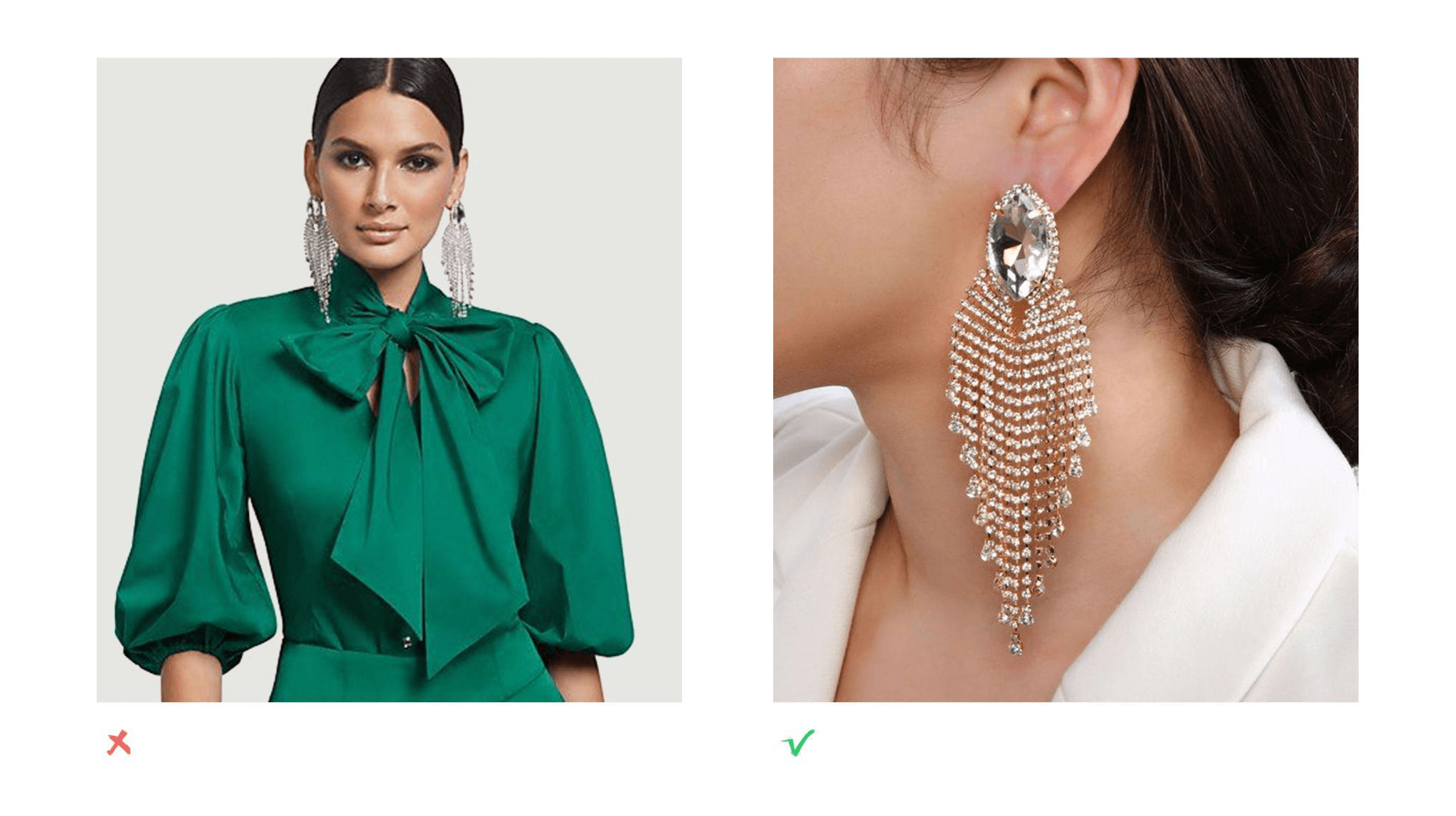
While it’s true that great packaging design attracts people all by itself, showing your product in use helps get people excited about your brand and helps tell a more visual story about what you have to offer. - Avoid showing models with direct eye contact(especially jewelry product).

Online shoppers tend to get distracted by models looking directly into the camera, especially when browsing through a large marketplace. Try to avoid direct eye contact in your feature image, and instead consider cropping in tighter on the product you're selling.
When is eye contact okay?
When an apparel or accessory product simply can’t be shown without including a model making eye contact, such as a hat or earrings, then the product should still occupy the majority of the space. This will help bring the buyer’s attention to what your actual product is.
Examples of great feature images
